

A proposed rebrand for Queensland Maritime Museum in Brisbane, Australia.
As the museum is surrounded by bigger and better funded attractions, the museum needed to highlight its unique and quirky nature. Proud to be a pillar in Queensland’s history, the museum remains an inviting and exciting place to be.

The identity is a deliberate nod to maritime visuals – the bright orange-red on the hulls of ships to make them visible in the ocean and the bold, legible type. Subheaders and dates are set in a monotype reminiscent of shipping forecasts.
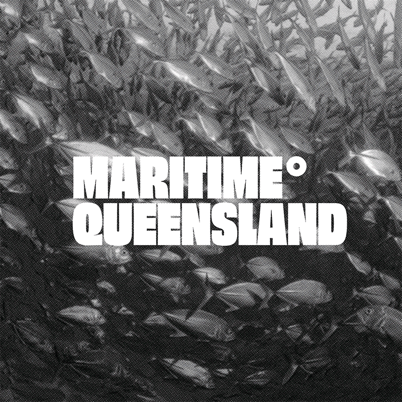
The use of monotone archival imagery shows Maritime Queensland's pride in their local history.


The museum has a lot of interesting space, including dry-docked ships, to use which could turn into a bar or music space on weekends, which would help attract locals who normally visit the bars nearby.
This could become a more regular thing with collaborations with local breweries, with profits going towards MQ's upkeep.

As well as attracting new audiences, the museum has to continue to be a fun and educational space for children, which they can achieve through installations, events and supporting local kids' water-sports.


